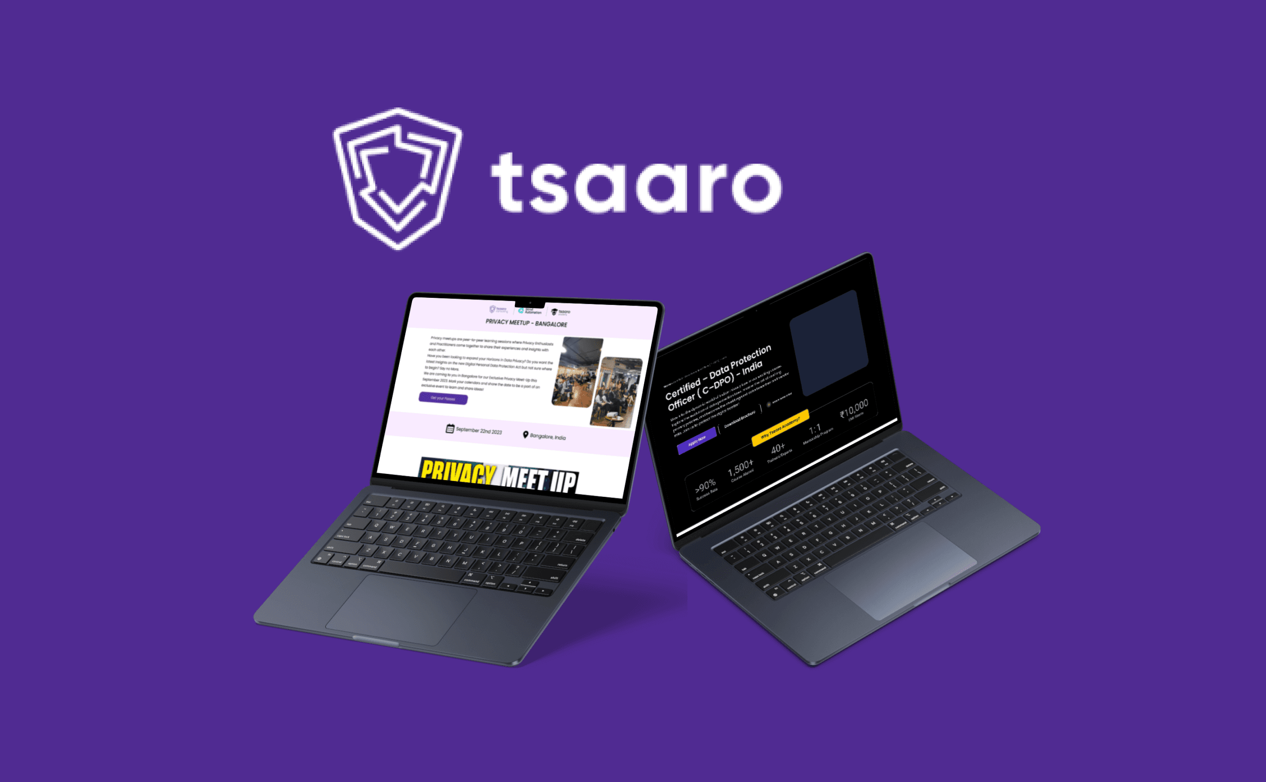
How we Increased Sales at Tsaaro Academy
Privacy Career Experts is a leader in Privacy education, who have trained more than 1000 professionals in the last 1 year. It is an education platform that provides training, network, and support to privacy professionals.
Role
UX/UI Design Intern
Industry
IT
Duration
6 months


Final Landing Page

My Impact
10-14% Conversion rate
20% increase in Marketing Qualified Lead (MQL)
Enhanced User Experience by using best UI Principles
Increased number of attendees for bootcamp than previous year
Stage 1: Empathize (Ethnographic Research)
What is the Problem?
We have to design a landing page for a Bootcamp. The landing page for the Data Processor Compliance Bootcamp of pervious year had low conversions and high bounce rates, a difficult registration process. A redesign is needed to improve engagement and increase sign-ups.
What we need to Achieve?
To Enhance the user experience, attract more participants, and convey the key aspects of the bootcamp more effectively.
Who are the Target Audience?
Privacy professionals, corporate leaders, aspiring data privacy experts, legal and compliance professionals, and tech industry professionals seeking to deepen their expertise in data privacy and cybersecurity.
My Team
UX/UI designer (Me), Head of Tsaaro Academy, Marketing Team, Web Developers
Brainstorming & Discussions
We as a Team started this project by reviewing data from last year’s landing page performance

Figma design of previous year bootcamp to be improved
We collected data from 3 areas, 1. Heat Maps, 2. User Feedbacks and 3. Google Analytics

Heatmaps:
A) Clicks were more in Hero Section than Hero Section
B) More clicks and interaction in About Section
User Feedbacks:
A) Key information like pricing, location and date difficult to find
B) Benefits & Outcomes not very clear
C) No clear mention of who this masterclass is for
Google Analytics
A) High drop off rate near FAQ section
B) Users spent more time in "Who is for?" section
Stage 2: Define
How Might We Questions
HMW make key information (pricing, location, date) easily accessible to help users make quick decisions?
HMW present the Benefits and Outcomes more clearly to convey the value of the masterclass effectively?
HMW clearly communicate who this masterclass is intended for to help users identify its relevance to their goals?
HMW reduce the drop-off rate near the FAQ section by presenting answers to common questions earlier or in a more engaging format?
HMW leverage the time users spend in the "Who is it for?" section to reinforce the masterclass's relevance and encourage further exploration?
Stage 3: Ideate & Prototype
Next, with the help of HMW questions, me along with the team of Marketing and also developers involved in ideating. We discussed ideas in google meet. I have recreated this and added all the insights in Figjam below

Wireframing & Prototyping
Hero Section
Location, Date, Time and pricing details were clearly put unlike previous year design


New design of Hero Section
About Us, Benefits & Outcomes section
Moved About us section higher
Elaborated benefits & outcomes section


Who is it for section?
Mentioned clearly who can take this bootcamp

FAQ Section
FAQ section was redesigned now with accordion so that the information is not overwhelming for the users.
Stage 4: Test
The landing page was developed in WordPress after being approved by the marketing team and the Head of Tsaaro Academy.
How I saved Tsaaro Academy's money?
I consistently checked in with the marketing team about the landing page's performance. After gathering some data and insights, we reviewed Google Analytics and heatmaps again. Based on these insights, we stopped running google ads and identified the following problem:
Users tended to click on the yellow CTA rather than the top CTA. Additionally, feedback indicated confusion about whether both CTAs in the hero section served the same purpose.
After brainstorming, we concluded that only one CTA in the hero section was necessary, clearly detailing all relevant information.

After changing this we continued to launch the website where we found that there was 2-3% increase in conversion rate
Conclusion
By following structured UX methodologies, our team was able to design a better landing page that significantly increased the conversion rate.
Working at Tsaaro Academy as a UX/UI designer enhanced not only my design skills but also my soft skills, such as teamwork, taking responsibility, identifying problems, and finding solutions. This experience taught me the value of collaborative ideation, iterative problem-solving, and the impact of user-centered design on business outcomes, equipping me with a well-rounded skill set that I look forward to applying in future projects.
Final Landing Page

My Impact
10-14% Conversion rate
20% increase in Marketing Qualified Lead (MQL)
Enhanced User Experience by using best UI Principles
Increased number of attendees for bootcamp than previous year
Stage 1: Empathize (Ethnographic Research)
What is the Problem?
We have to design a landing page for a Bootcamp. The landing page for the Data Processor Compliance Bootcamp of pervious year had low conversions and high bounce rates, a difficult registration process. A redesign is needed to improve engagement and increase sign-ups.
What we need to Achieve?
To Enhance the user experience, attract more participants, and convey the key aspects of the bootcamp more effectively.
Who are the Target Audience?
Privacy professionals, corporate leaders, aspiring data privacy experts, legal and compliance professionals, and tech industry professionals seeking to deepen their expertise in data privacy and cybersecurity.
My Team
UX/UI designer (Me), Head of Tsaaro Academy, Marketing Team, Web Developers
Brainstorming & Discussions
We as a Team started this project by reviewing data from last year’s landing page performance

Figma design of previous year bootcamp to be improved
We collected data from 3 areas, 1. Heat Maps, 2. User Feedbacks and 3. Google Analytics

Heatmaps:
A) Clicks were more in Hero Section than Hero Section
B) More clicks and interaction in About Section
User Feedbacks:
A) Key information like pricing, location and date difficult to find
B) Benefits & Outcomes not very clear
C) No clear mention of who this masterclass is for
Google Analytics
A) High drop off rate near FAQ section
B) Users spent more time in "Who is for?" section
Stage 2: Define
How Might We Questions
HMW make key information (pricing, location, date) easily accessible to help users make quick decisions?
HMW present the Benefits and Outcomes more clearly to convey the value of the masterclass effectively?
HMW clearly communicate who this masterclass is intended for to help users identify its relevance to their goals?
HMW reduce the drop-off rate near the FAQ section by presenting answers to common questions earlier or in a more engaging format?
HMW leverage the time users spend in the "Who is it for?" section to reinforce the masterclass's relevance and encourage further exploration?
Stage 3: Ideate & Prototype
Next, with the help of HMW questions, me along with the team of Marketing and also developers involved in ideating. We discussed ideas in google meet. I have recreated this and added all the insights in Figjam below

Wireframing & Prototyping
Hero Section
Location, Date, Time and pricing details were clearly put unlike previous year design


New design of Hero Section
About Us, Benefits & Outcomes section
Moved About us section higher
Elaborated benefits & outcomes section


Who is it for section?
Mentioned clearly who can take this bootcamp

FAQ Section
FAQ section was redesigned now with accordion so that the information is not overwhelming for the users.
Stage 4: Test
The landing page was developed in WordPress after being approved by the marketing team and the Head of Tsaaro Academy.
How I saved Tsaaro Academy's money?
I consistently checked in with the marketing team about the landing page's performance. After gathering some data and insights, we reviewed Google Analytics and heatmaps again. Based on these insights, we stopped running google ads and identified the following problem:
Users tended to click on the yellow CTA rather than the top CTA. Additionally, feedback indicated confusion about whether both CTAs in the hero section served the same purpose.
After brainstorming, we concluded that only one CTA in the hero section was necessary, clearly detailing all relevant information.

After changing this we continued to launch the website where we found that there was 2-3% increase in conversion rate
Conclusion
By following structured UX methodologies, our team was able to design a better landing page that significantly increased the conversion rate.
Working at Tsaaro Academy as a UX/UI designer enhanced not only my design skills but also my soft skills, such as teamwork, taking responsibility, identifying problems, and finding solutions. This experience taught me the value of collaborative ideation, iterative problem-solving, and the impact of user-centered design on business outcomes, equipping me with a well-rounded skill set that I look forward to applying in future projects.


